

An App to find car parking
Overview
Park Car is a mobile app that serves as a way for travelers to find parking with fewer clicks.
ROLE:
User Experience & Interface Design, User Research
INDIVIDUAL PROJECT
Mehtab K Badwal
TOOLS USED:
Figma, Illustrator, Photoshop
DURATION:
10 weeks
Background
We all know how hard it can be to park your car in an overcrowded parking lot somewhere in downtown. Mainly it is a real challenge when you don’t even know whether there are vacant parking spots, or you will have to leave and look for another place to park.
The number of people traveling in the car keeps on rising. Though each person has a distinct destination, the predicament they face is alike which is parking the car. Everyday 300000 people are finding difficulty to get parking slot on time.
Research
As we noted above, the problem of parking lots and a limited number of spots was the major challenge that could be solved with the parking app. But when I started to delve into the matter’s substance, I found out that this is not the only problem to solve.

To gain a better understanding of the problem at hand, ten user interviews were planned and conducted regarding pain points and future opportunities for enhancement. Participants who use cars and motorcycles regularly for work and leisure were asked to share about their experience finding a parking.

Pulled Interview Quotes
Challenges to Success
Attracting users of all community levels.
To get users at all biennial conditions routinely.
To manage the customers if they are over crowded at a time.
To expand the service to a large population of consumers.
Defining the Problem
People in big cities have problems to find the better places to park.
The map apps that those people use to find location doesn’t offer an efficent map service.
Many times people are suprised with different prices of parking lots.
The most private parking lots doesn’t accept credit card and mobile payments.
People doesn’t have the habit of history of payments with parking lots, and brings issues to their personal financies.
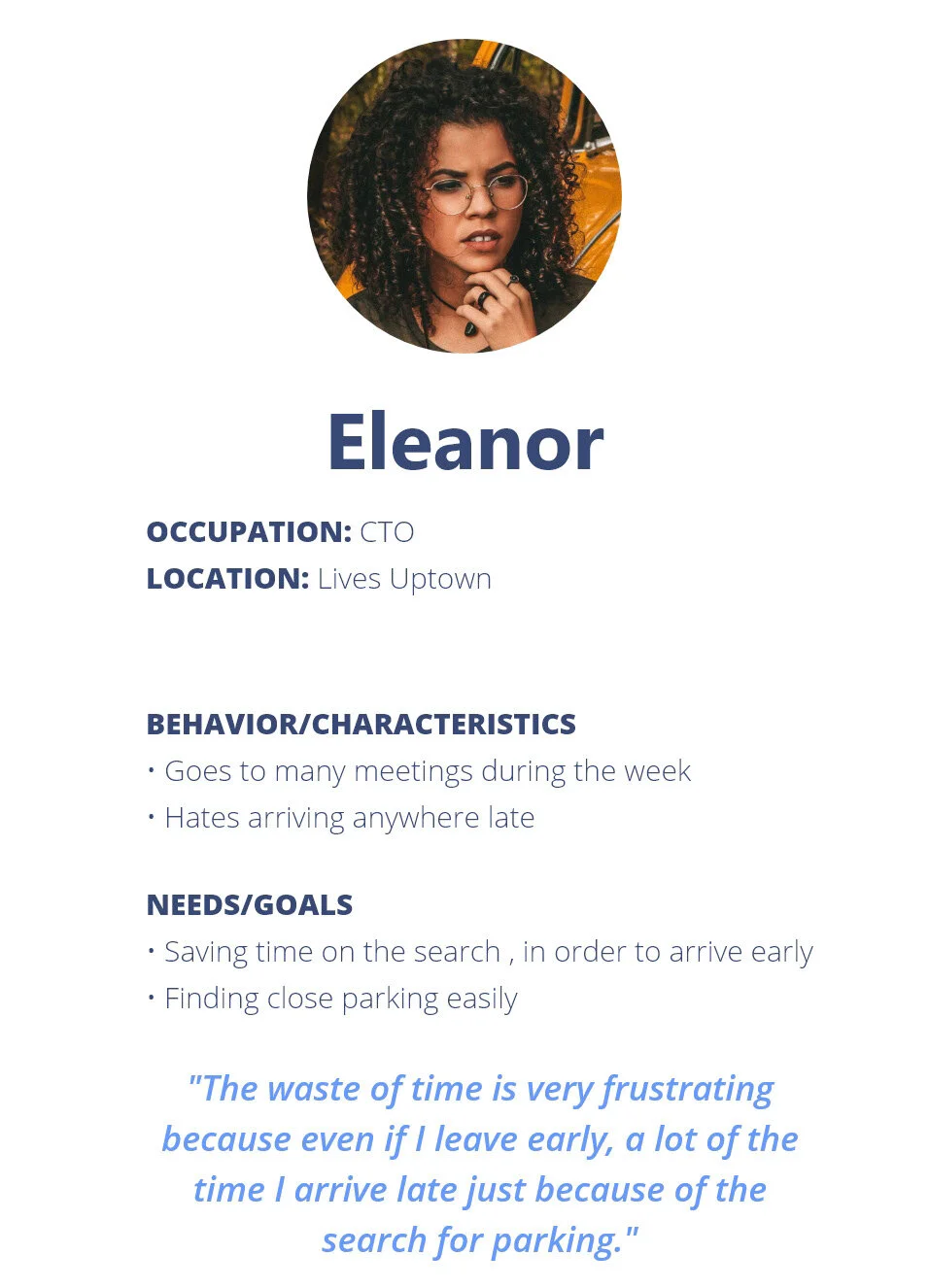
User Persona
Another critical stage of the development process was the target audience identification. I did UX research and analysis of primary users who will use the parking app, singled out their pain points, and created a few portraits of typical app users.

Primary User Persona
Secondary User Persona
User Flow
Keeping Ben and Eleanor in mind, I mapped their user behavioral flow from planning their drive, through using a parking app, to finding parking. Understanding the users' decision making and flow allowed me to brainstorm the necessary features and opportunities required for users to successfully navigate through Park Car.
The major pain point that has been found in the study, long search durations, lead to creating the main scenario.

User Flow
Design Solutions
Agility to find a parking lot with vacancy;
Scheduling and better route to the parking lot;
More time and less missing appointments.
Where the problem is analyzed, the solution is achieved.
The top purpose of designing the app is to lessen the workload of people. The app is intended in an uncomplicated way with very easy steps. Once you open the app, it will take you all the way from tracking the spot to booking. Users of any age or any background can use the app smoothly as I have decreased the Performance Load.
Hence the app which has been devised for life’s everyday issue is designed with Accessibility.

3. The abridged look and necessary options of the app lure the user and grant them tp handle it more and often the frolic way assuring Aesthetic Usability.

4. Color stabs deep into the heart. I have given a plain white background and the icons represented in specific colors for each option.

5. All the details to be selected are given in simple sequential screens, assuring Affordance. Anyone can use the app at any time without tangles.
6. The icons are placed following Fitt’s law. With the progression of the steps to be selected are given in the accessible points.
7. Recognition Over Recall: The back option is given even at the last screen where it can be identified by the user easily and evoked in future.
8. Satisfying: All the essential options needed by the user are given, cheering their bubbles. They can view their parking slot at the last screen with the specific screen appearance and the icon for booking is given at the right base.
Prototype
