Designing and documenting a design system for cutting-edge next generation pool automation platforms
This project is subject to a Non-Disclosure Agreement (NDA), and as such, specific details have been intentionally omitted or abstracted to maintain confidentiality. The presented information is a reconstructed overview, designed to showcase my work while respecting the privacy and sensitivity of the project.
Project
Fluidra, a global leader in the pool and wellness sector, embarked on a project to revolutionize its pool automation platform. The initiative aimed to create a unified, intuitive, and scalable user experience across its digital offerings. The cornerstone of this transformation was the development of a new design system, meticulously crafted in Figma, to standardize UI/UX elements, ensuring consistency and efficiency across the platform.
Pool Pulse is a design system for Fluidra’s Next Generation Pool Automation platform. It was our job to design and creatively direct the creation and documentation of the design system. Our main requirement was to create a flexible eco system that’s evolving to meet the requirements of Fluidra’s products and services. Through this design system we’re establishing, defining and constantly improving the User Experience of the Fluidra’s applications.
ROLE:
System Designer, UX/UI Designer, Product Designer
TEAM
Mehtab K Badwal
Tulip Das
Mariana Motta
TOOLS USED
Figma
WHERE
Fluidra, 2023
Process
In the initial phase of developing the design system, we focused on experimenting with three distinct internal products (mentioned below) to apply and refine the system. This process involved discovering, establishing, and stress-testing a style and library of components. As the project progressed, we constructed an adaptive and responsive library of UI components, which we integrated into the Figma Library. This strategic move empowered our team of product designers with the ability to swiftly assemble UIs and workflows. By utilizing consistent, pre-designed, editable, and versatile Figma components, the team could concentrate on enhancing user experience without the need to redesign elements repeatedly.
Every detail of the system's design was documented, initially (because of time limitation) over Figma so it was easily accessible by the team, and later will be developed into Confluence.
Step 1 - Design Exploration
From the beginning, we adhered to the established Fluidra guidelines, embarking on a journey to deeply understand the users of Fluidra Oasis and ICD. This process involved delving into the exploration of colors, fonts, and the overall aesthetic for the app and its in-can display (ICD). Presented here is an overview of the Fluidra Oasis user.
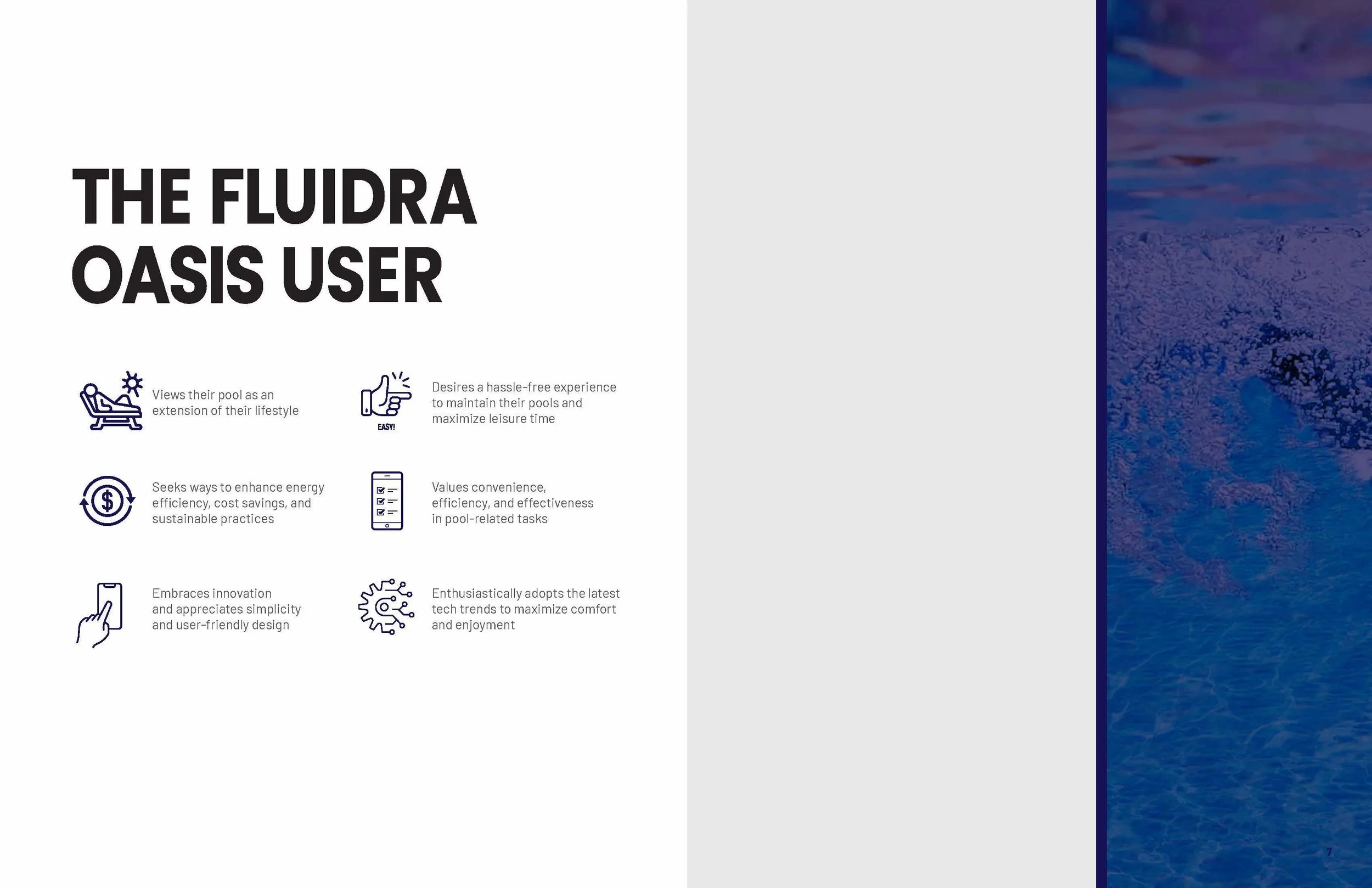
Simple, clear and clean
Adhering to Fluidra’s voice we focused primarily on creating a consistent and recognizable identity that resonates with target audience, fosters emotional connections and helps build trust and loyalty over time. Simplicity, readability and load time are all paramount. We knew early on we were striving for a clear, clean and friendly aesthetic.
Color theory
The system is predominantly white, purple and blue. It’s important the design doesn’t distract from the content, so subtlety is key. Brighter colors are used to convey meaning. Iris Teal is used for primary actions since Iris Teal is one of Fluidra’s core brand colors. To keep the aesthetic clean we kept the background White. We used Fludira’s Purple Gradient which includes two primary colors ( Electric Violet and Midnight Blue) for headers. Red is for alerts, yellow is for warning and green is for success.
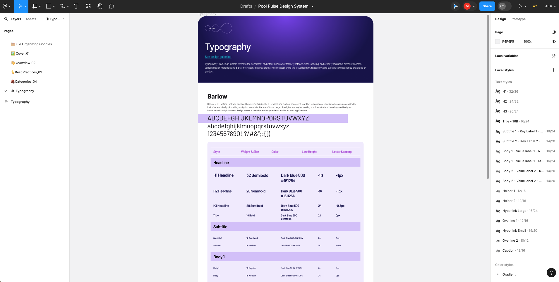
A typeface to match
Fluidra uses modern fonts for all their products. For Pool Pulse design system we ended up choosing BARLOW for all headings and body copy. It's a sophisticated and friendly type that is slightly rounded. It's a variable font that can be used in various ways. It works well on both display type and body type.

Product design
We researched many design systems for inspiration, and while many were visually impressive, they often didn't work well because they weren't designed for real products, content, and data. Our approach ensures our designs are flexible and effective in all possible scenarios, not just the ideal ones.
It is vital to create a design system using products it will be applied to, with real data and problems.
Our aim isn't just to make the most attractive system; it's to design one that truly meets our requirements—focusing on business needs for Pool Pulse, and customer needs for other systems. While we strive to make delightful products, our main goal is to improve the user experience (UX).
Below is a little insight into the three products that shaped the system:
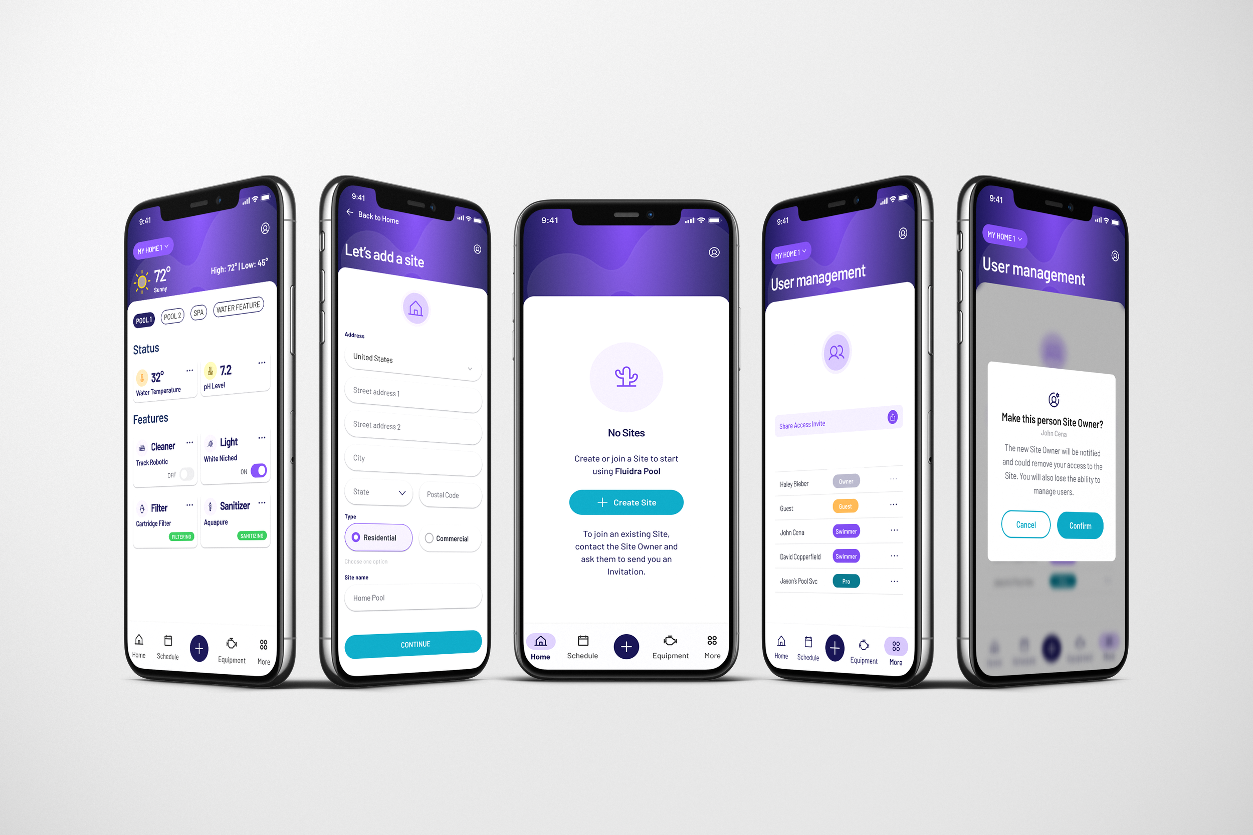
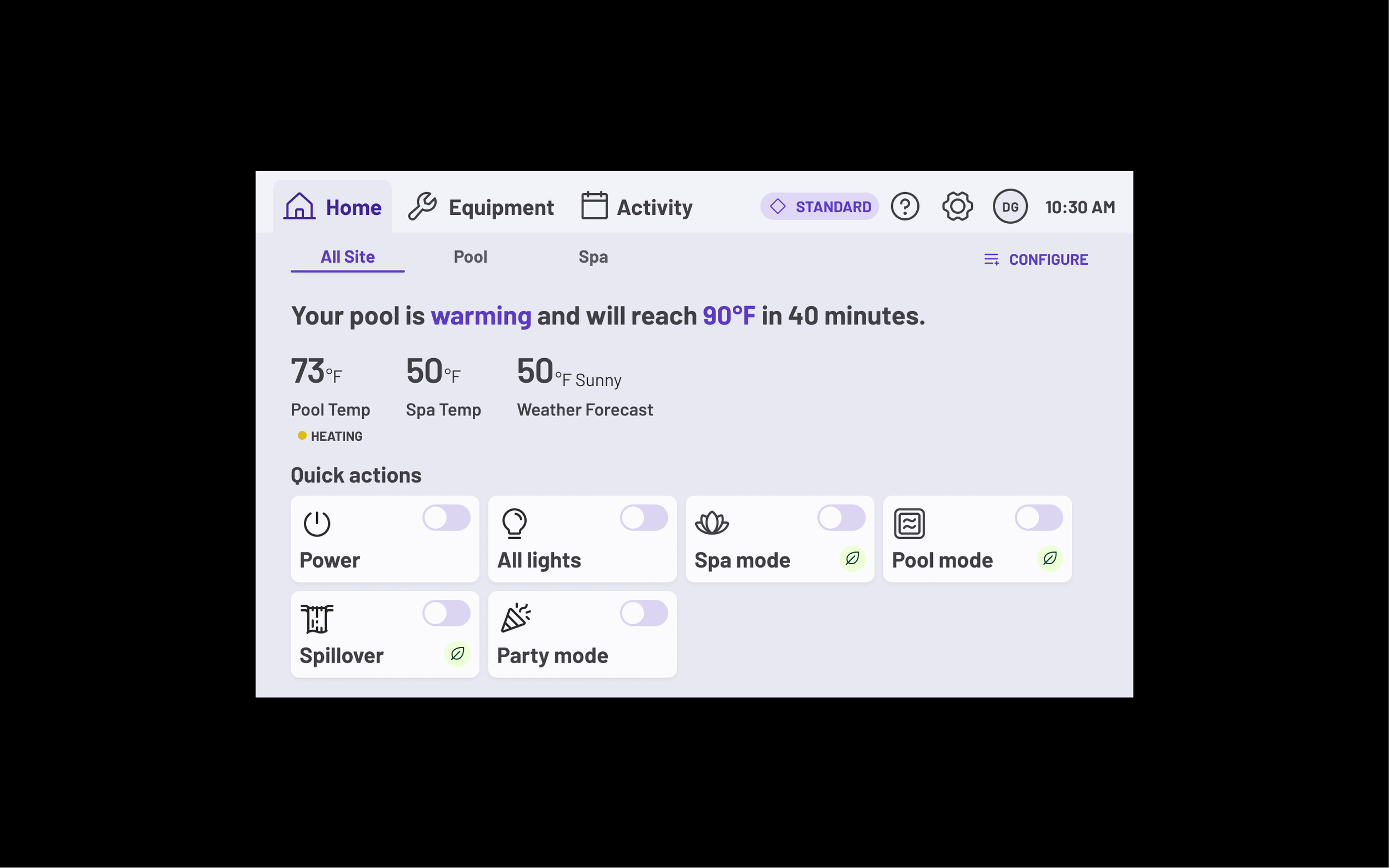
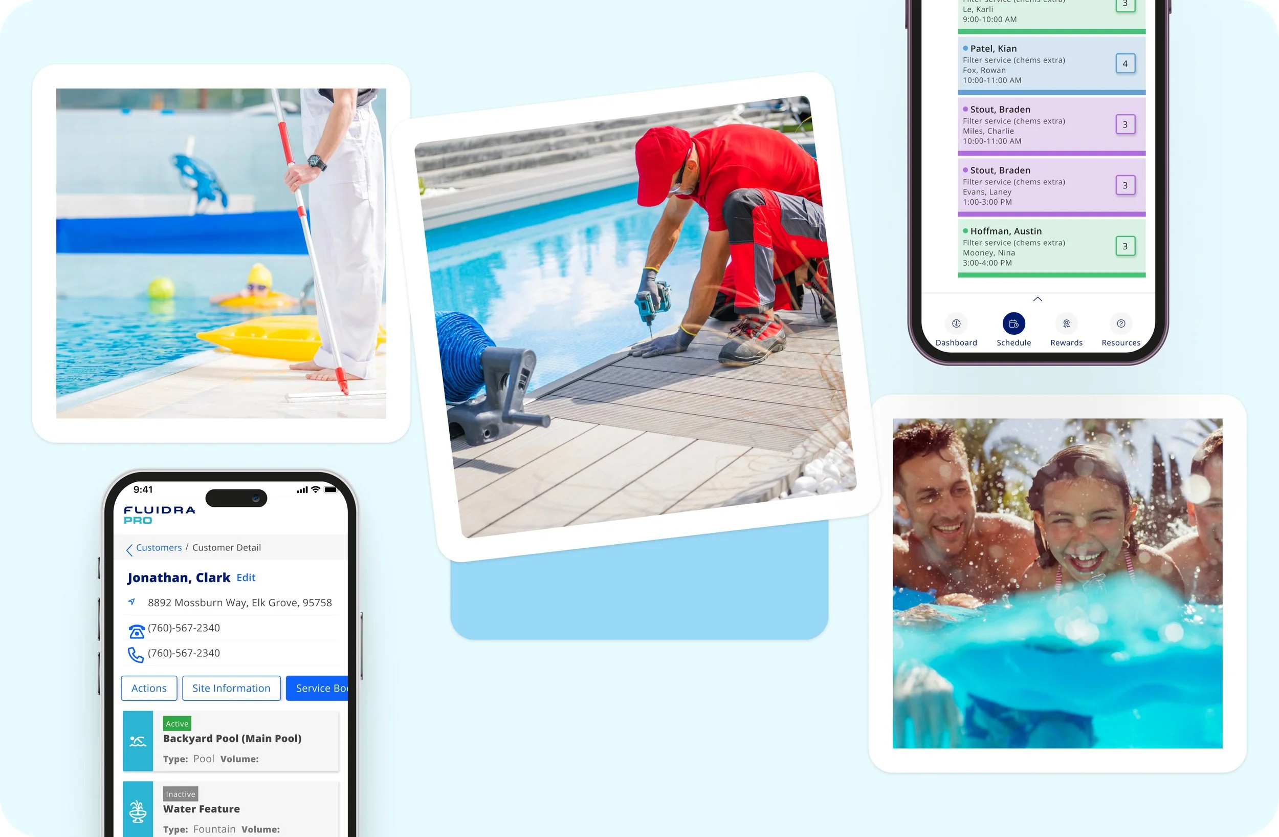
Product 1: Pool Automation App (aka ‘Fluidra Oasis’ )
The design system we developed was crafted specifically for Flutter, ensuring seamless functionality across both Android and iOS platforms. This approach enabled the creation of an app designed to engage a B2C audience, providing a unified user experience across diverse mobile ecosystems.
Product 2: In-Can Display
In-can displays in pool automation systems are integrated digital screens that allow users to easily monitor and control their pool's features, such as water quality, temperature, and lighting. These intuitive interfaces provide real-time information and enhance the pool management experience by making system adjustments both convenient and accessible. The design system was capable to work with QT framework, which was our primary development platform for ICD.


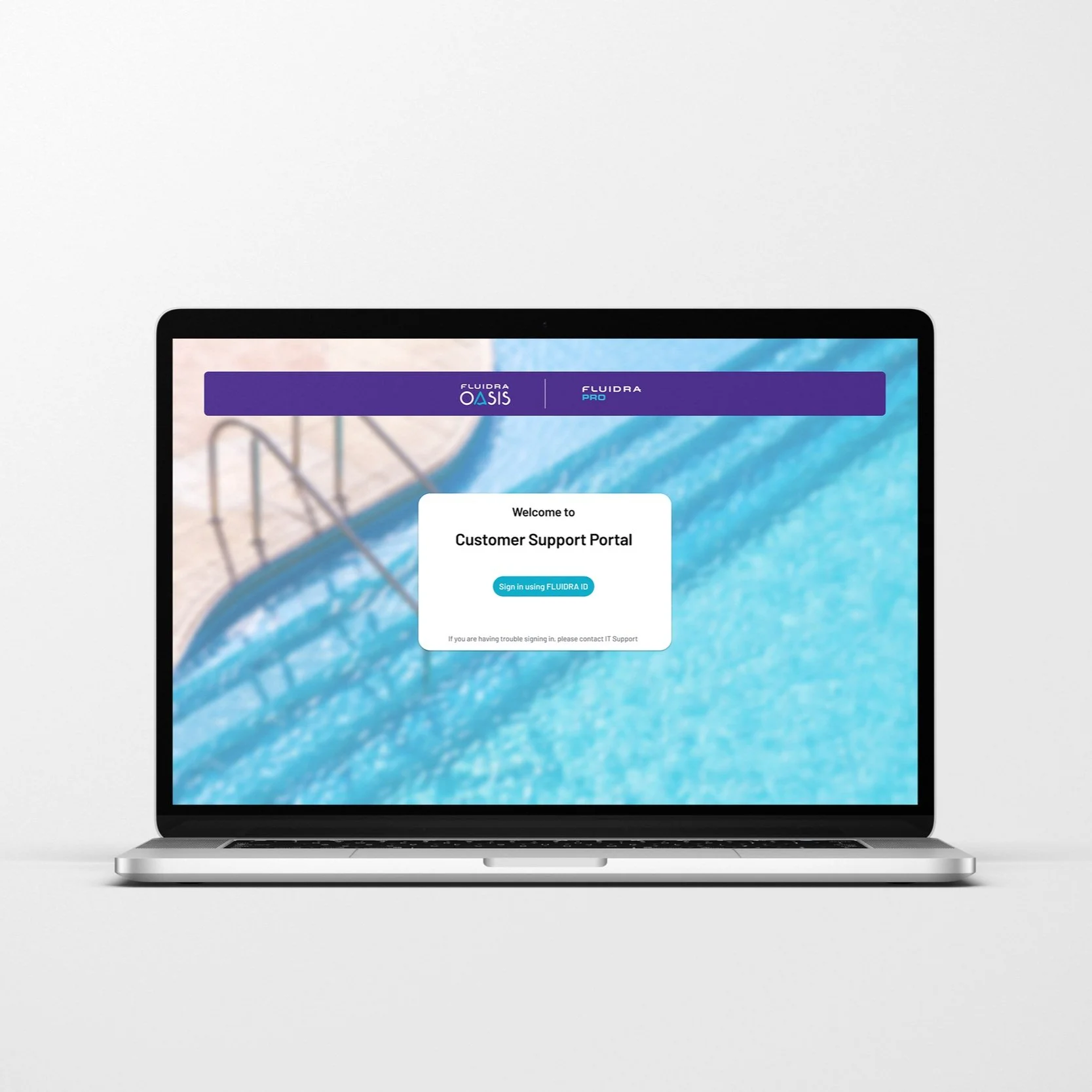
Product 3: Customer Experience Portal
A CX portal, or customer experience portal, is a digital platform that gives customers access to information and services through a website. It's usually private and secure, and requires customers to log in to their account. For this product, we had to make sure that our design system is equipped to design for web as well.

Product 4: Future Scope - Tablet
The design system is poised for future expansion, with plans to apply it to designing interfaces for Home Tablets, ensuring a cohesive user experience across these additional digital touchpoints.
Step 2 - Creating components
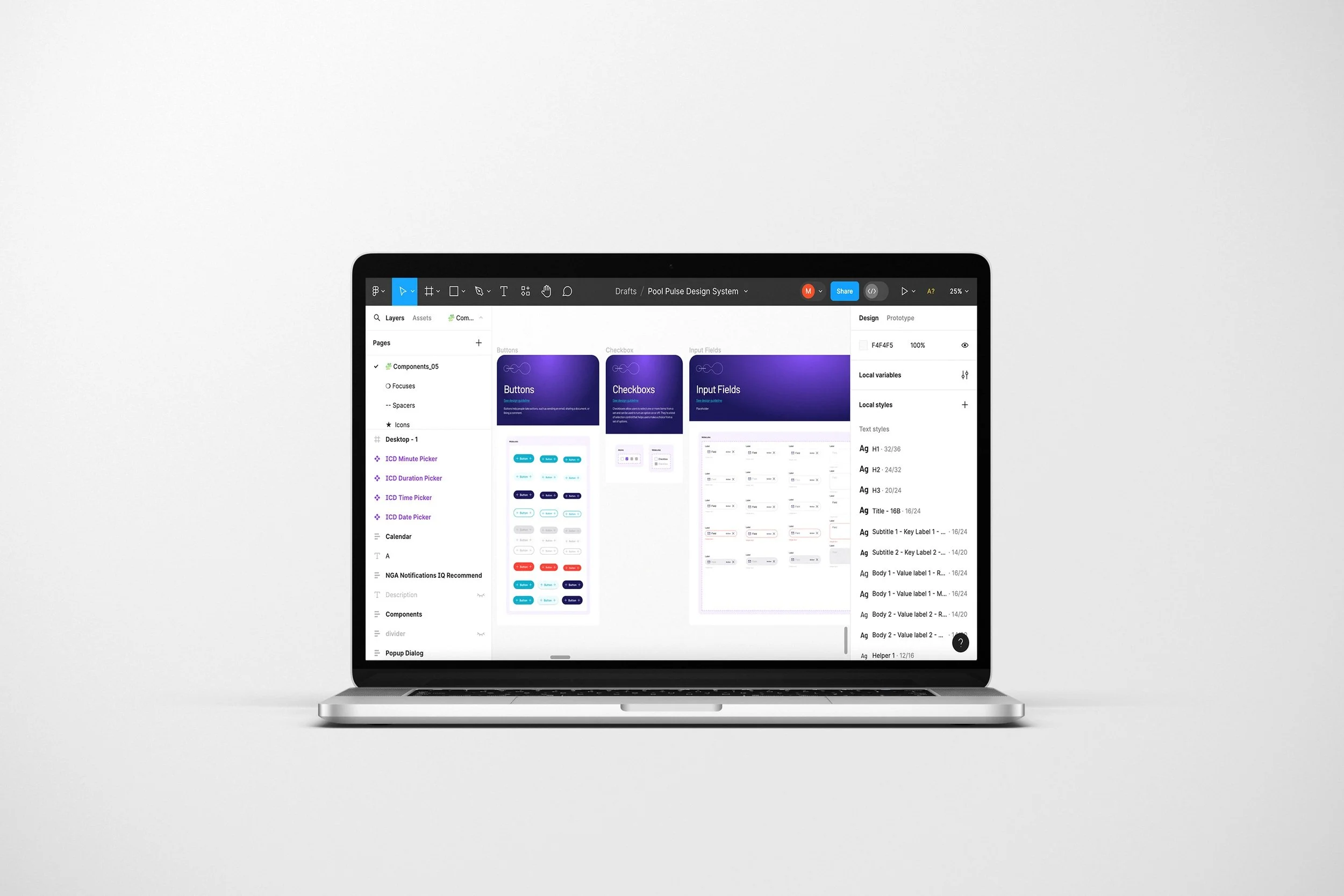
To create our design system our primary tool was Figma. Our design system follows the Atomic Design Principles and is built using Figma’s Auto Layouts, Tokens and Interactive components. It seamlessly bridges imagination and implementation, ensuring consistency and efficiency across all our Fluidra’s products.
Our system is divided into six levels:
FOUNDATIONS: Colours, Fonts, Grids etc.
ATOMS: Buttons, Inputs, Icons etc.
MOLECULES: Tabs, Paginations etc.
ORGANISMS: Lists, Cards, Filters etc.
TEMPLATES: Standard Page Layouts.
PAGES: Instances of templates.
Consistent UI components make a huge difference in guiding a user through a product.
Foundations
These are fundamental elements that provide guidelines for design and user interface decisions. For eg: color palette, typefaces, shadows, and spacing etc. They help establish a strong visual identity, brand consistency, and ensure a cohesive user experience across all digital products and platforms. We have use Figma styles and variables to create tokens. Design tokens are small pieces of data that define the design elements of a user interface, such as colors, typography, and spacing. By using Figma Tokens in Pool Pulse Design System for Figma, designers can use design tokens that can be easily shared and updated across their projects.
For example, the "borderRadius" token is a design element that determines the roundness of the corners of UI elements such as buttons, input fields, and cards. If the borderRadius token is set to 6 pixels, then all elements that use the borderRadius token will have a border radius of 6 pixels. If the borderRadius token is changed to 12 pixels, then all elements that use the borderRadius token will have their border radius changed to 12 pixels.
Atoms
Atoms are the smallest, indivisible elements of a design. These elements encapsulate basic visual properties and can be reused across various components. For eg: buttons, input fields, switches, etc. You can combine these components to build bigger components.
Molecules
Molecules are combinations of atoms to create simple, functional components. For eg: forms, cards, and buttons with icons. These components are still relatively self-contained, independent and reusable. For eg: A card element; it usually would consist of an image block, some text, and a call-to-action button.
Organisms
Organisms are more complex components that consist of molecules and atoms, forming cohesive sections of an interface. They represent larger functional units and are more specific to the application's context. For eg: The header, menu bar, data grids, etc. are the commonly defined organisms.
Templates
Templates are the layout structures that establish the overarching design and content arrangement of a page. They provide a framework for placing organisms and define the overall structure of a UI. They help to define a standard page layout across multiple pages with similar functionality.
Pages
Pages represent instances where real content is populated into templates. These instances showcase the design in action, demonstrating how different components and structures will interact to create a complete user experience. They are high fidelity and what our users will see in the finished product.
Why we chose Figma as our Tool
Figma stands out as a premier UX design tool due to its comprehensive features tailored for modern design needs. Its Auto Layout feature simplifies the creation of responsive designs, automatically adjusting components across varying screen sizes. Figma’s robust plugin ecosystem enhances functionality within the design workflow, while Developer Mode facilitates smoother handoffs by allowing direct access to design specifics. Additionally, variables in Figma streamline prototyping, promoting consistency across design elements. The real-time collaboration feature allows teams to work simultaneously on the same files, enhancing productivity and alignment. Together, these features make Figma an indispensable tool for producing high-quality, user-centered designs efficiently.
On responsiveness
Pool Pulse is designed to be responsive. Figma supports responsive design through key features that ensure designs adapt seamlessly across devices. Auto Layout allows for dynamic adjustment of components based on content, while Constraints control element behavior during frame resizing, crucial for maintaining scalable layouts. Responsive Resizing helps test and adjust layouts to various screen sizes directly within the interface. Grids and Layout Columns provide a structured foundation adaptable to different breakpoints, facilitating complex grid-based designs. Additionally, Variants and Component Properties enable the creation of component variations for different screens within a single component set, streamlining the design process across multiple devices. Together, these tools enable designers to create flexible, consistent, and usable designs effortlessly.
Working with established components frees us to focus on user experience, problem solving, and building meaningful features and products.
Covering all scenarios
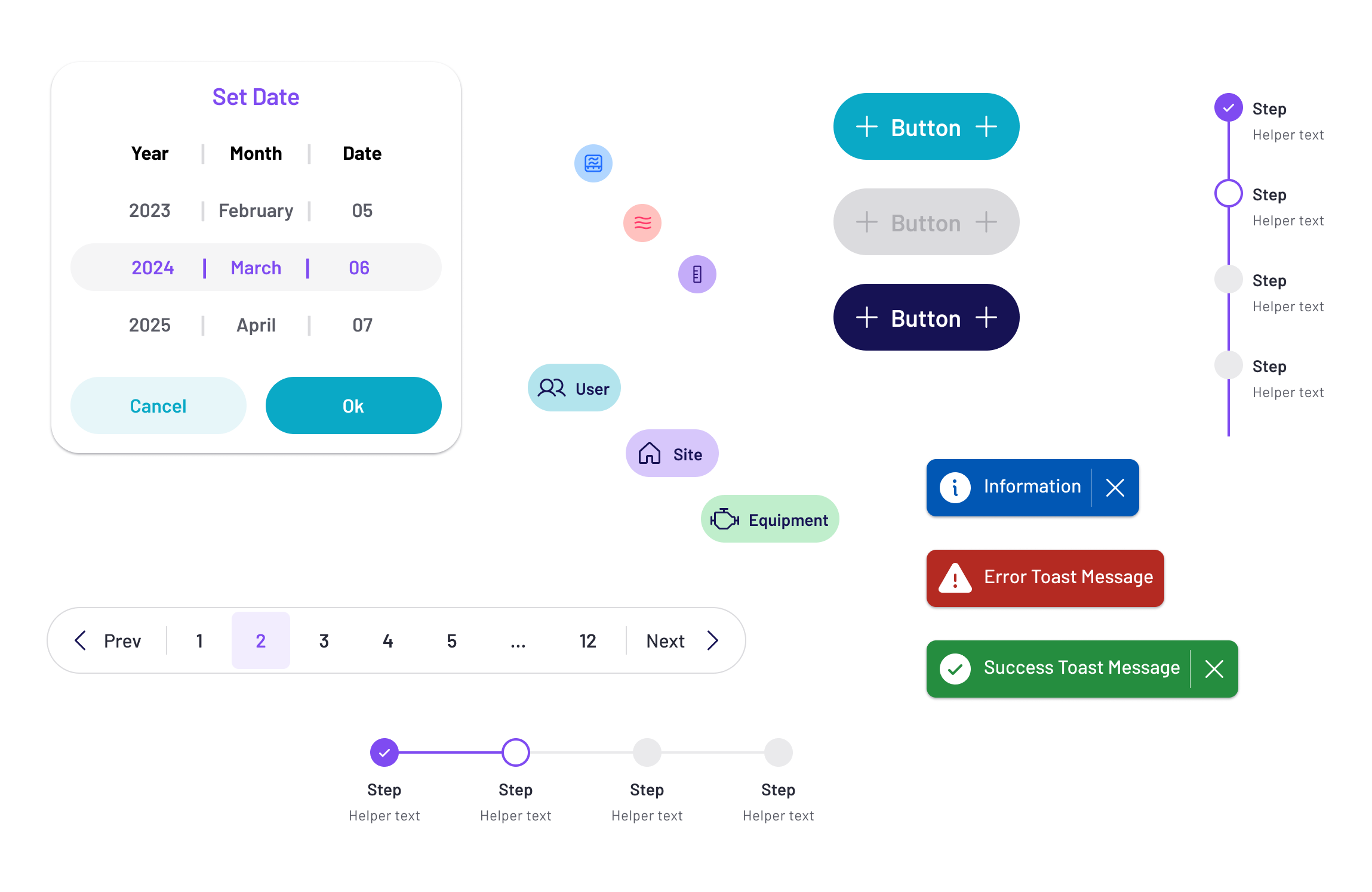
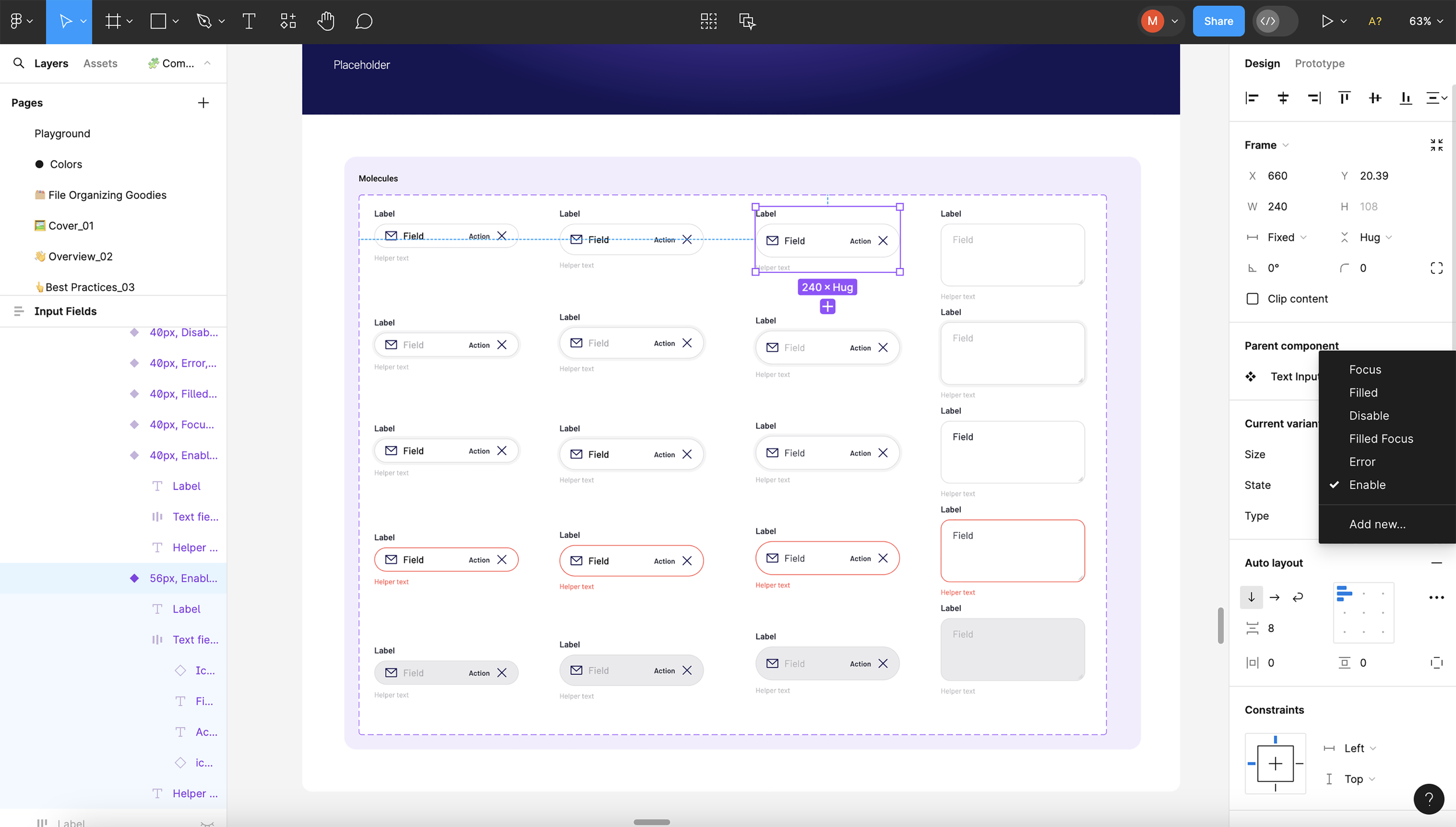
We account for all ‘states’ in the system. We have leveraged Figma’s variants and properties to create our all “states” components. Using properties we make sure that our component library is as small as possible and it provides more flexibility when using the component in a design. For example, a button component we have icon to the right and to the left of the text. Instead of creating different variants for right only icon, left only icon and text only we have created properties. This allows us to hide and show icon as per the used case.
Variants are only created when there is a requirement of different state, size or color. For example, a form input has a focus, enabled, error and disabled state. In the example below for our input field, you’ll see we have selected “56px/enabled/text field”. From the right side panel you can access a dropdown of all other properties — and change the state to “56px/error/text field” or “56px/disabled/text field”. This is great for designing and mapping out product flows!

Step 3 - Documenting a design system
When creating a design system it’s important to be mindful that you won’t be the only designer (or developer) who works with it. Literally documenting the design system was the biggest challenge for us on this project because of the time constraint.
How do you document a design system?
We started out reading and researching how other teams had done this. Fortunately, the Internet is full of answers for this, and many companies have made their documentation public.
Our initial goal, having seen so many stellar examples online, was to create a website to document the system, specs, showcase example uses, and specify guidelines for all patterns and components. It would act as a quick reference, or a bible to study in detail. But because the project is under NDA we can not make this design system public yet. So our second best option is to create a confluence page within the internal system.
However, we didn’t want to be held back by the design, build and time constraints of creating a confluence page for this. So to get started we simply started typing in Figma. Every time we create a new component we created a document section for that component providing all the necessary details about that component.
It’s easily accessible by all our team, plus they can comment using “figma comments”, which is great for feedback.
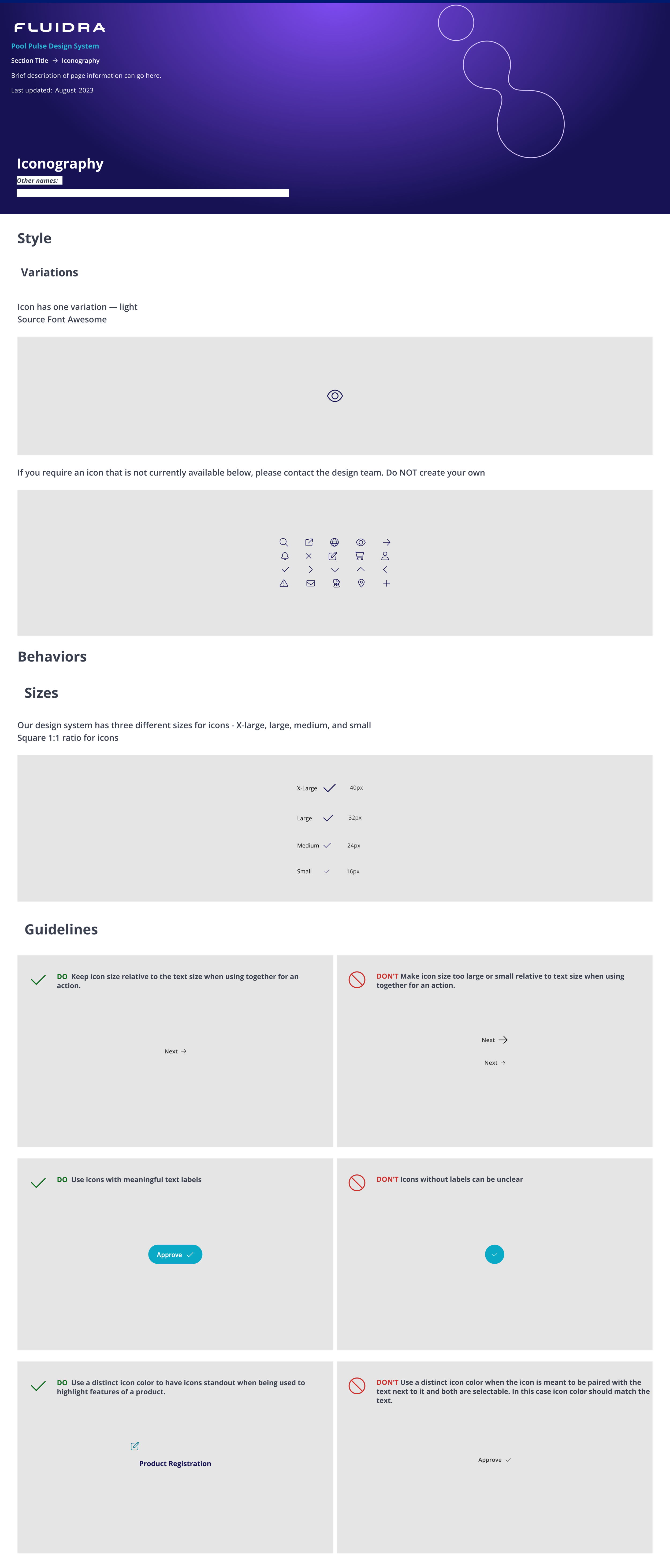
Preview of our documentation
I have shown an example of design documentation below for iconography components.
Step 4 - Engineering a design system
As the documentation was taking shape, the design team needed a way of efficiently communicating and tracking the build and integration of the system to the developers. We chose to use Figma’s Dev Mode for this. Figma's Developer Handoff, often referred to as "Dev Mode," is a feature designed to bridge the gap between design and development by providing developers with all the necessary information to implement the designs created in Figma. This mode is particularly beneficial for web and app development teams to ensure that the final product matches the design intent accurately.
It offers code snippets for CSS, iOS, and Android, allowing developers to directly copy properties such as fonts, colors, and layout settings, significantly speeding up coding and reducing errors. Dev Mode also provides precise measurements and spacing details to ensure accurate implementation of designs. Additionally, developers can export assets in various formats suitable for different platforms, and inspect elements for detailed property information, enhancing understanding and integration of design elements. Version control is another feature, enabling developers to access and compare various versions of the design, which facilitates revisions and ensures consistency. These combined features of Dev Mode enhance the efficiency and accuracy of developing digital products from Figma designs.
By enabling developers to access and utilize design details directly from Figma files, Dev Mode streamlines the handoff process, reduces the likelihood of misinterpretation, and helps maintain design consistency across the development of the product.
Naming conventions
Last but not least: One of the goals of the design system is to get designers, developers and product managers all speaking the same language. We can help to achieve this with consistent, semantic naming conventions we’re all familiar with (in the design and code), be it Sass variables, font styles, colors, UI components, templates or page names.
It’s all taking shape nicely.
This is not the end
As we all know, a design system is never truly "completed". Design systems are living entities that should evolve continually as new requirements emerge, technologies advance, and user needs change. They are iterative by nature, requiring regular updates, additions, and refinements to stay relevant and effective. Maintaining a design system is an ongoing process that involves constant feedback from users and stakeholders, regular testing and learning, and adaptation to integrate new insights and technologies. This continuous evolution helps ensure that the design system remains aligned with the organization’s goals and user expectations, making it a sustainable asset for the long term.
🔅 More of my Projects 🔅

Feb 2023・Fluidra・UX/UI Design I Design System・B2B I Dashboard I Onboarding
Seamlessly integrated Fluidra's rewards program into the Fluidra Pro B2B app and web platform, delivering a unified single sign-on experience for access to the complete suite of pool professional services and solutions.

Working with financial data analyst experts I created the visual foundations, interactions and experience for a suit of AI-powered tools.
May 2024・Stealth Startup・Product Design I Design System・B2B I SaaS I D2C
2023 - 2024・Fluidra・UX/UI Design・B2B I Service I Dashboard
Revamped the Fluidra Pro B2B app to enhance user engagement by streamlining functionality and modernizing the interface for a better professional user experience.